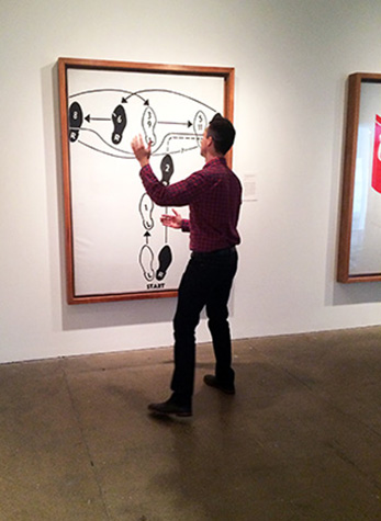
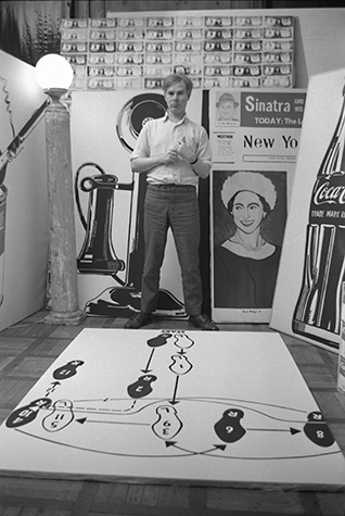
Walking through the seventh floor galleries, I rarely passed by Andy Warhol’s Dance Diagram [2] (Fox Trot: “The Double Twinkle-Man), 1962[1] without seeing someone attempting to Fox Trot. It is not often I see people dancing in museums, but that is precisely what interested me about this particular piece. For a painting hung in a static manner, I found this level of viewer engagement unusual. Looking down the gallery at another painting Typewriter [2][2], I did not see viewers attempting to type, nor when I looked at Telephone[3] did I see viewers taking a call. The paintings were completed in 1961 and 1962, respectively; thus, Warhol would have been working on these during the same time as Dance Diagram. I wondered what it was about this work that compelled people to dance.


In 1998, Nicolas Bourriaud, a French art critic, developed a highly influential theory of “relational aesthetics,” which he defined as, “an art taking as its theoretical horizon the realm of human interaction and its social context, rather than the assertion on an independent and private symbolic space.”[8] He wished to take a new approach to the interpretation of contemporary art, and part of his theory is that a work stems much further than just the physical piece itself. It is greatly influenced by the experience of a viewer and claims “art is a state of encounter.”[9] This interaction has a viewer question who creates the art: is it the artist, or is it your interaction with a piece? Bourriaud argued the latter.[10]
Taking my reading into account, I thought of Dance Diagram in its context at the museum. Beyond the physical act of dancing, a museum or gallery is an unusual space for a dance diagram. In a gallery that is often quiet with people thoughtfully stopping and looking at paintings, there is an inherent playfulness to dancing, which breaks the unspoken social expectations of silent reflection. I certainly felt a closer connection to the work after engaging with the instructions, but I did not feel like Bourriaud’s “relational aesthetics” had answered wholly why patrons of the museum felt compelled to dance.
In 2004, Claire Bishop, currently a contemporary art professor at City University of New York, wrote a harsh critique of Bourriaud’s theory of relational art. “I am not suggesting that relational artworks need to develop a greater social conscience… I am simply wondering how we decide what the “structure” of a relational art work comprises, and whether this is so detachable from the work’s ostensible subject matter or permeable with its context.”[11] This facet of the critique points out that Bourriaud overlooks the importance of subject matter, which she believes cannot be detached from the finished product.[12] Thinking about Dance Diagram, Warhol’s source material was directly from a Fox Trot diagram, which was always meant to instruct. Thus, the subject matter is inherently participatory, and I find that plays a vital role in the reasoning why viewers are drawn to engage with this work over works executed in a similar manner like Typewriter and Telephone.
From both personal experience and research, I found that elements of both context and subject matter are major reasons why viewers dance in front of Dance Diagram; but, for me, Claire Bishop’s emphasis on subject matter was a stronger argument to relate to this painting. The source material is essential when confronted with the piece because that is what differentiates it from Warhol’s other paintings of the early 1960s. Walking through the seventh floor gallery, one would notice that each work was taken from a specific source and completed around the same year, which is emphasized by the chronology of the 2014 collection re-hang in the gallery. However, what sets apart Dance Diagram is the fact that it is a diagram and is clearly recognizable as such. Warhol then transforms the ordinary diagram through his skillful eye and groundbreaking aesthetic to create a new experience, which pushed the boundaries of painting. Next time you come and visit the museum, I recommend taking a dance break on the seventh floor.
[1] Warhol, Andy. “Dance Diagram [2] (Fox Trot: “The Double Twinkle-Man)” 1962. Casein and graphite on linen.
[2] Warhol, Andy. “Typewriter [2]” 1961. Casein and graphite on linen.
[3] Warhol, Andy. “Telephone” 1962. Acrylic and Graphite on linen.
[4] King, Margery The Andy Warhol Museum. Carnegie Museum, Pittsburgh, 1994. Print p. 157
[5] The Staff of The Andy Warhol Museum. Andy Warhol, 365 Takes: The Andy Warhol Museum Collection. New York, NY: H.N. Abrams in Association with the Andy Warhol Museum, 2004. Print. p. 27
[6] Frei, Georg, and Neil Printz. Paintings and Sculpture 1961-1963: Warhol 01: The Andy Warhol Catalogue Raisonne. New York, NY: Phaidon, 2002. Print.
[7] Frei, Georg, and Neil Printz. Catalogue Raisonne
[8] Bourriaud, Nicolas. Relational Aesthetics. Paris: Leses Du Réel, 2002 p.14
[9] Bourriaud. p. 18
[10] Bourriaud. p. 27
[11] Bishop, Claire. “Antagonism and Relational Aesthetics.” October 110 (2004) p. 65
[12] Bishop, Claire. p. 64 – 65

